
EABA Website
Redesign
EABA Website
Redesign
EABA Website
Redesign
Overview
Case study about an Art App designed to enhance art history and art in general knowledge in a new and fun way.
UX/UI
UX Research
Prototype
Mobile App
Timeframe
5 Months
Role
UX/UI Designer
Industry
Scientific
Tools
Introduction
The European Algae Biomass Association (EABA) is dedicated to fostering collaboration and facilitating knowledge exchange within the realm of algae biomass production and its multifaceted applications. However, their website was outdated, lacking aesthetic appeal, and fell short in adhering to many UX best practices.
Goal
The goal was to design an art app that enriches museum visits by offering informative content, while also ensuring users stay engaged and entertained in their exploration of art and its rich history in their everyday life.
UX/UI Audit
UX/UI Audit
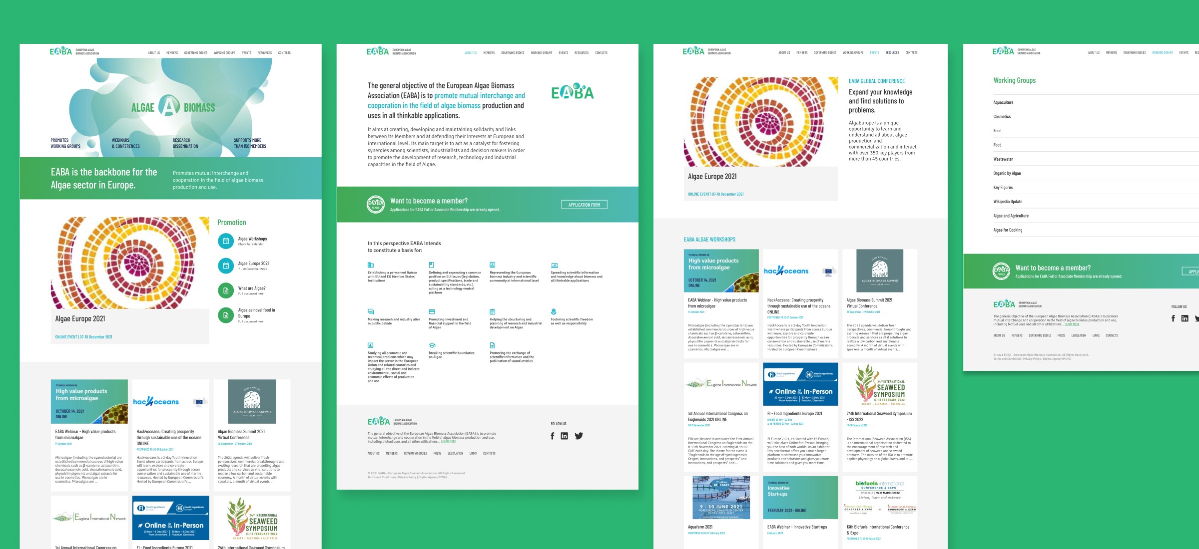
The previous design, while suitable for a scientific audience, appeared overly technical and lacked appeal.
It appeared outdated and failed to engage users effectively. Furthermore, event promotion failed to attract new users, and event registration suffered due to the process being on a separate page, hindering user engagement and event visibility.
The “Become a Member” page, crucial for user retention, also lacked efficacy in convincing users to join.
Other pages didn’t require significant alterations as they had minimal content or complexity.


Key Discoveries
The redesign should prioritize visual appeal, modernity, and intuitive design to enhance user engagement. Specific issues, such as streamlining event registration, need addressing, as effective event promotion and registration are crucial for user engagement.
In conclusion while some pages required minimal changes, the homepage, events page, and “Become a Member” page were deemed most critical for redesign.
UX/UI Audit
The previous design, while suitable for a scientific audience, appeared overly technical and lacked appeal.
It appeared outdated and failed to engage users effectively. Furthermore, event promotion failed to attract new users, and event registration suffered due to the process being on a separate page, hindering user engagement and event visibility.
The “Become a Member” page, crucial for user retention, also lacked efficacy in convincing users to join.
Other pages didn’t require significant alterations as they had minimal content or complexity.
Key Discoveries
The redesign should prioritize visual appeal, modernity, and intuitive design to enhance user engagement. Specific issues, such as streamlining event registration, need addressing, as effective event promotion and registration are crucial for user engagement.
In conclusion while some pages required minimal changes, the homepage, events page, and “Become a Member” page were deemed most critical for redesign.
Benchmark
Benchmark
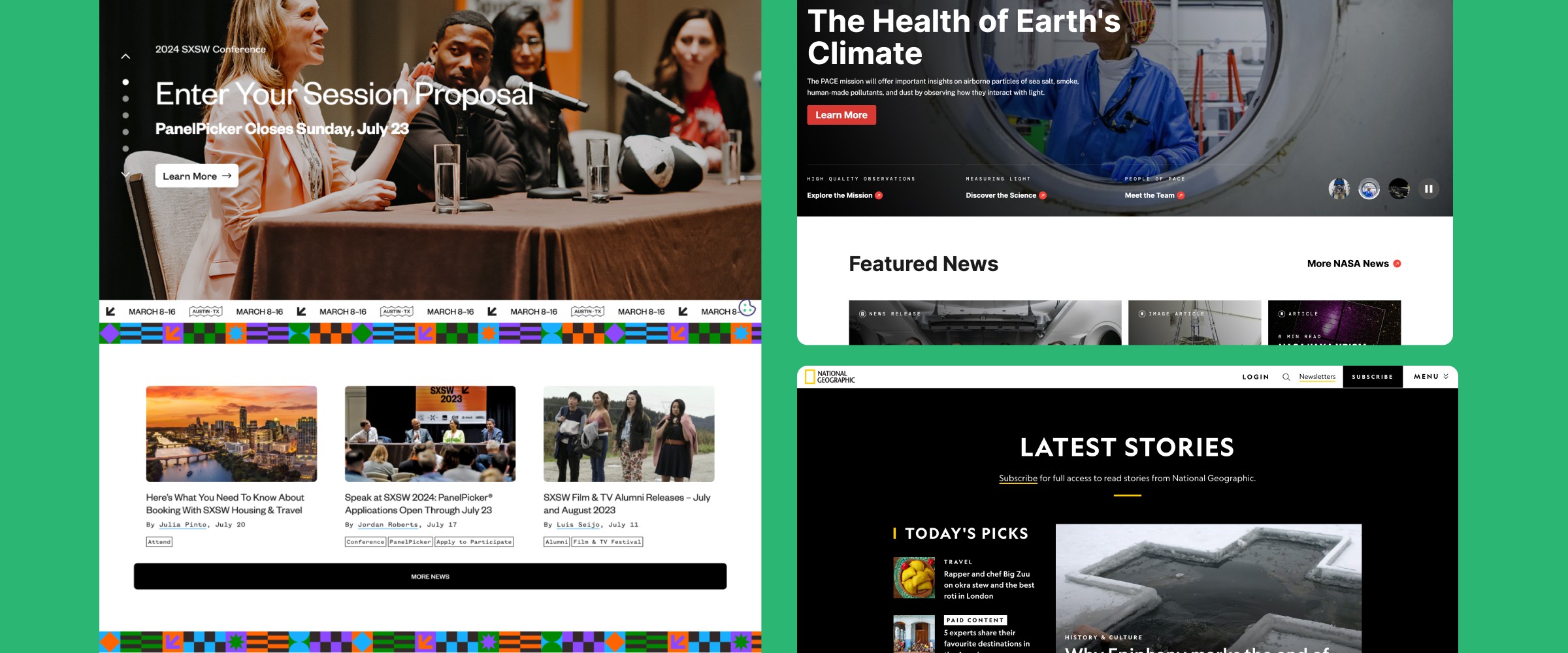
This phase involved a search for websites related to scientific and research areas, as well as event-centric platforms and also indirect competition. This included a basic exploration of visual aesthetics and functionalities.
Benchmark
This phase involved a search for websites related to scientific and research areas, as well as event-centric platforms and also indirect competition. This included a basic exploration of visual aesthetics and functionalities.
Lo-Fi Wireframes
Lo-Fi Wireframes
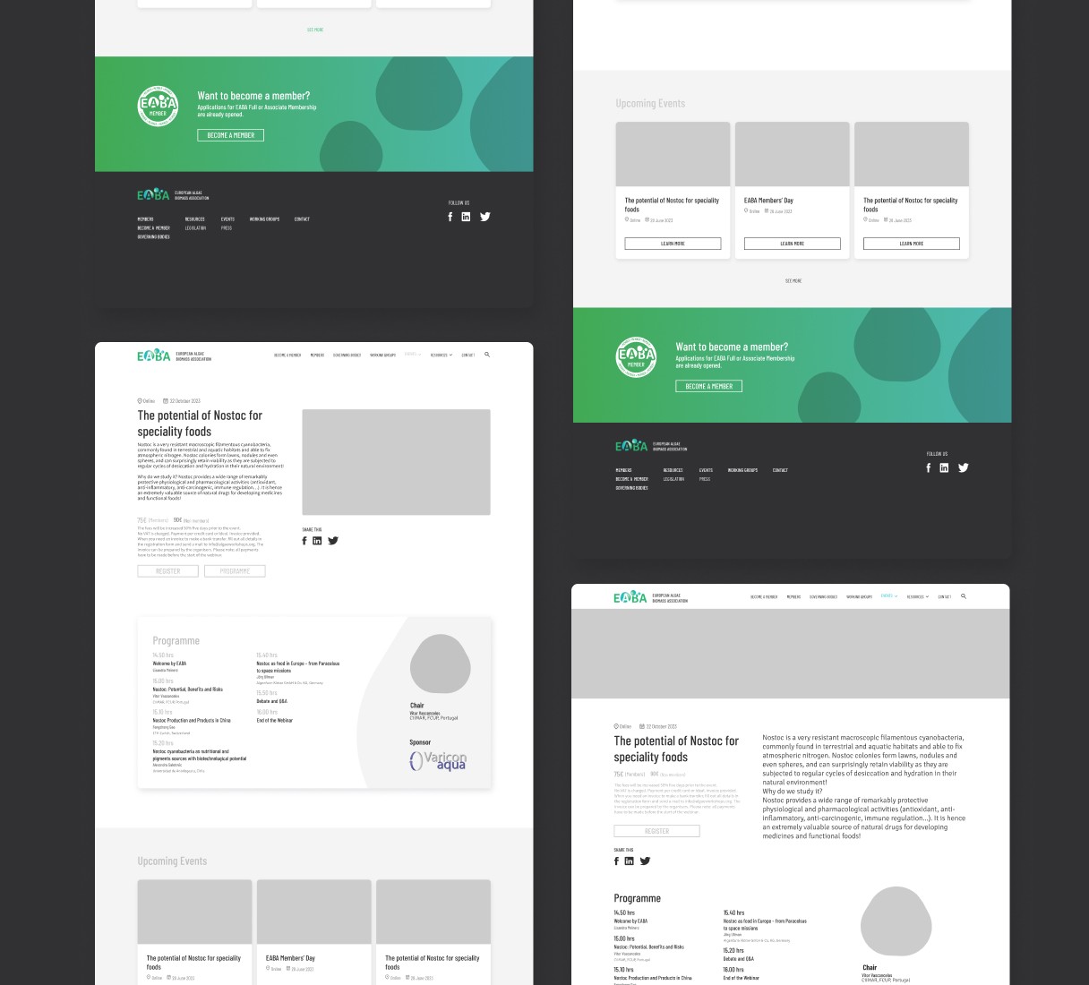
After the research phase, I began designing low-fidelity wireframes and brainstorming potential pages, as showcased below. Some of these pages were exploratory, serving as initial concepts to experiment with different layouts before finalizing to the final UI design.


Lo-Fi Wireframes
After the research phase, I began designing low-fidelity wireframes and brainstorming potential pages, as showcased below. Some of these pages were exploratory, serving as initial concepts to experiment with different layouts before finalizing to the final UI design.
Final UI Design
Final UI Design
In the final UI, I implemented the typography and colors outlined in the brand guidelines, consistent with the logo crafted by Tasting Design, onto the approved lo-fi wireframe, ensuring responsiveness throughout.
Below, I outline the primary adjustments and offer a comparison slide to elucidate the modifications made to each page.
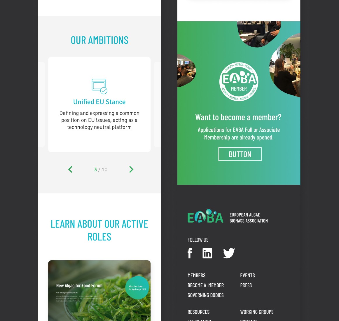
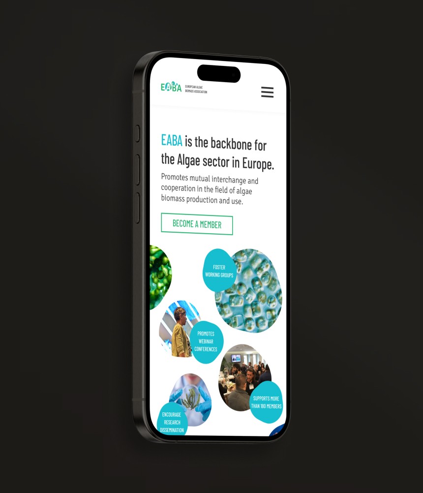
Homepage
To enhance the homepage’s initial impact, I opted for a modern design while preserving EABA’s identity. Additionally, the rest of the page became visually more engaging, with improved UI cards for event registration, ensuring a more appealing user experience.
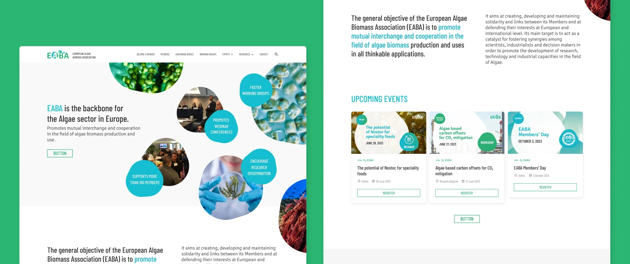
New Homepage
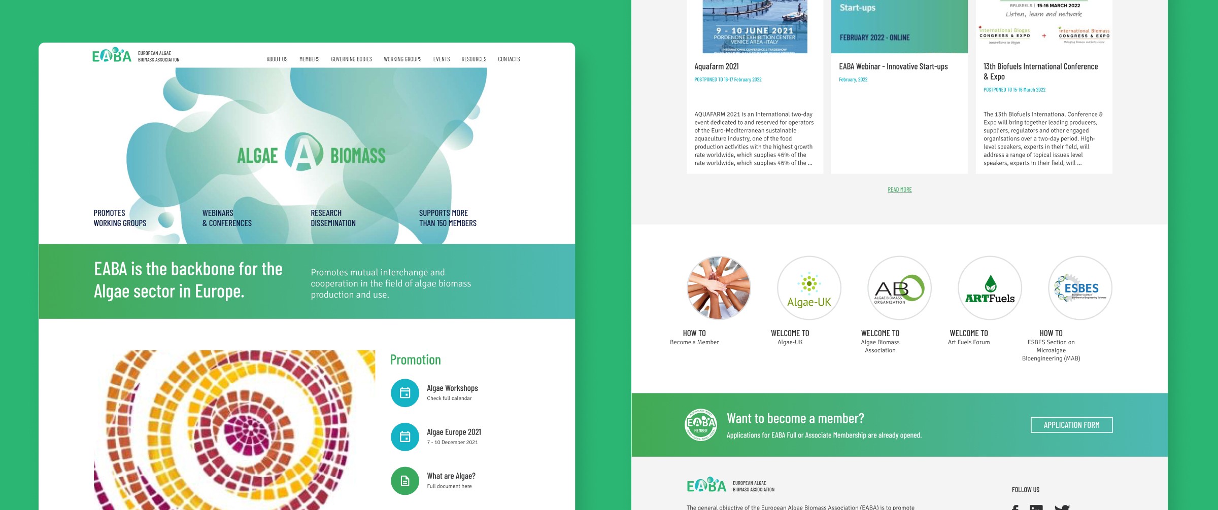
Old Homepage
New Homepage
Old Homepage
New Homepage
Old Homepage
New Homepage
Old Homepage
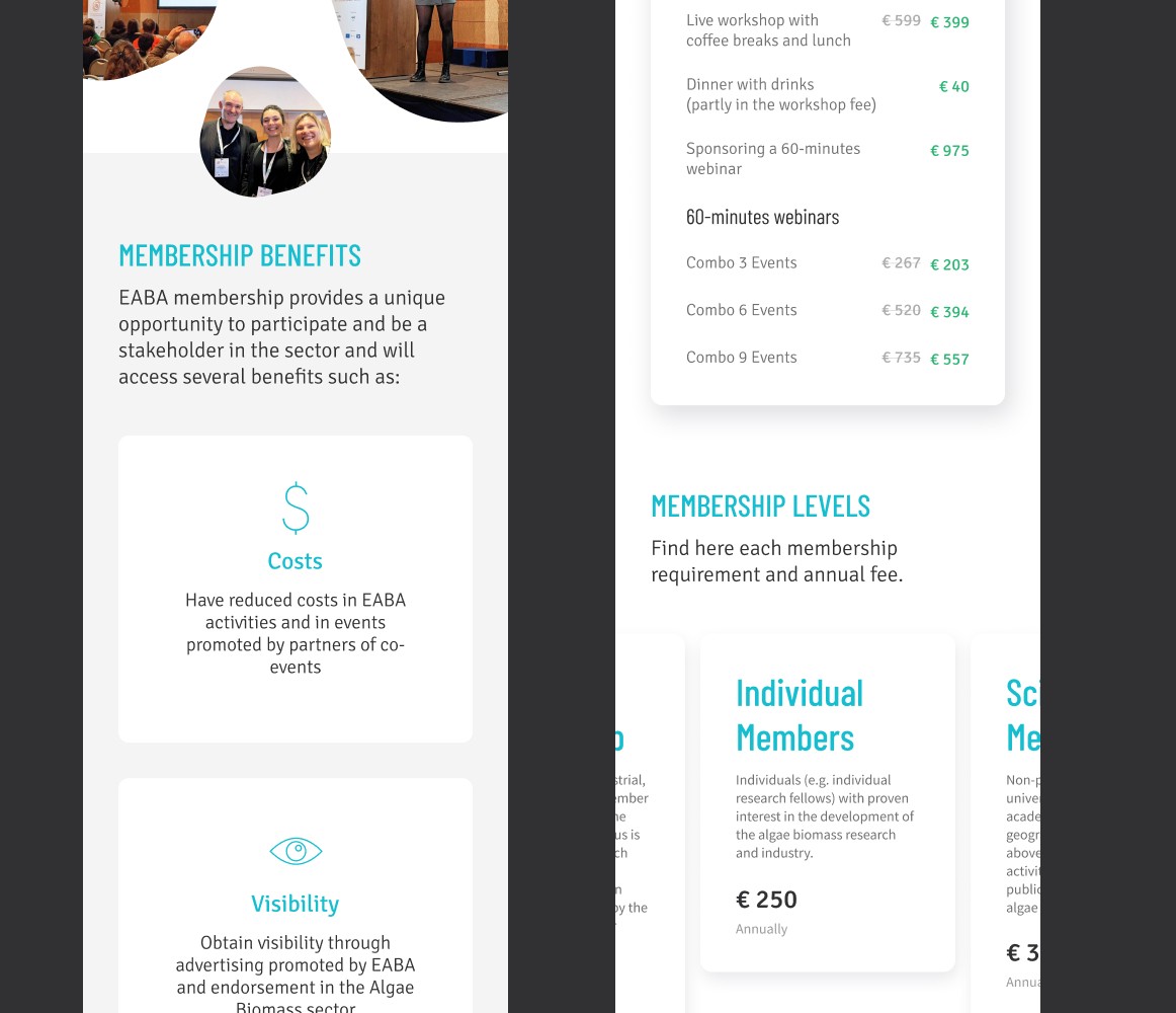
"Become a Member" Page
This page required a more compelling layout to encourage user membership. By drawing inspiration from similar websites with membership pages, I implemented industry best practices to enhance its effectiveness.
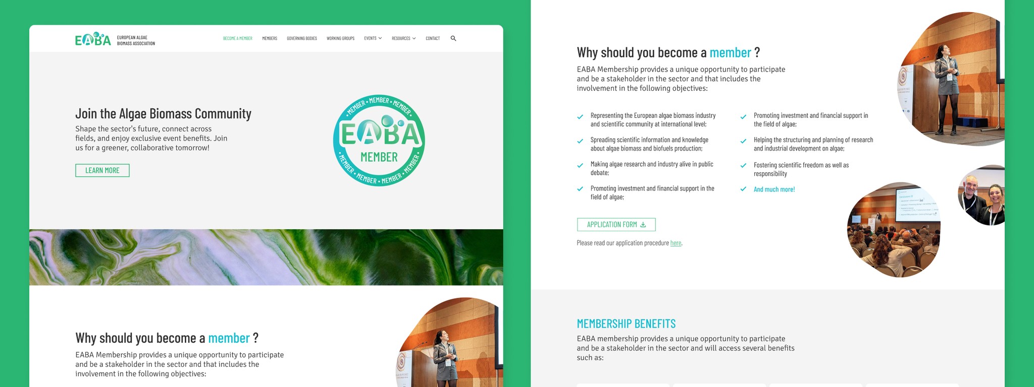
New "Become a Member" Page

Old "Become a Member" Page
New "Become a Member" Page
Old "Become a Member" Page
New "Become a Member" Page
Old "Become a Member" Page
New "Become a Member" Page
Old "Become a Member" Page
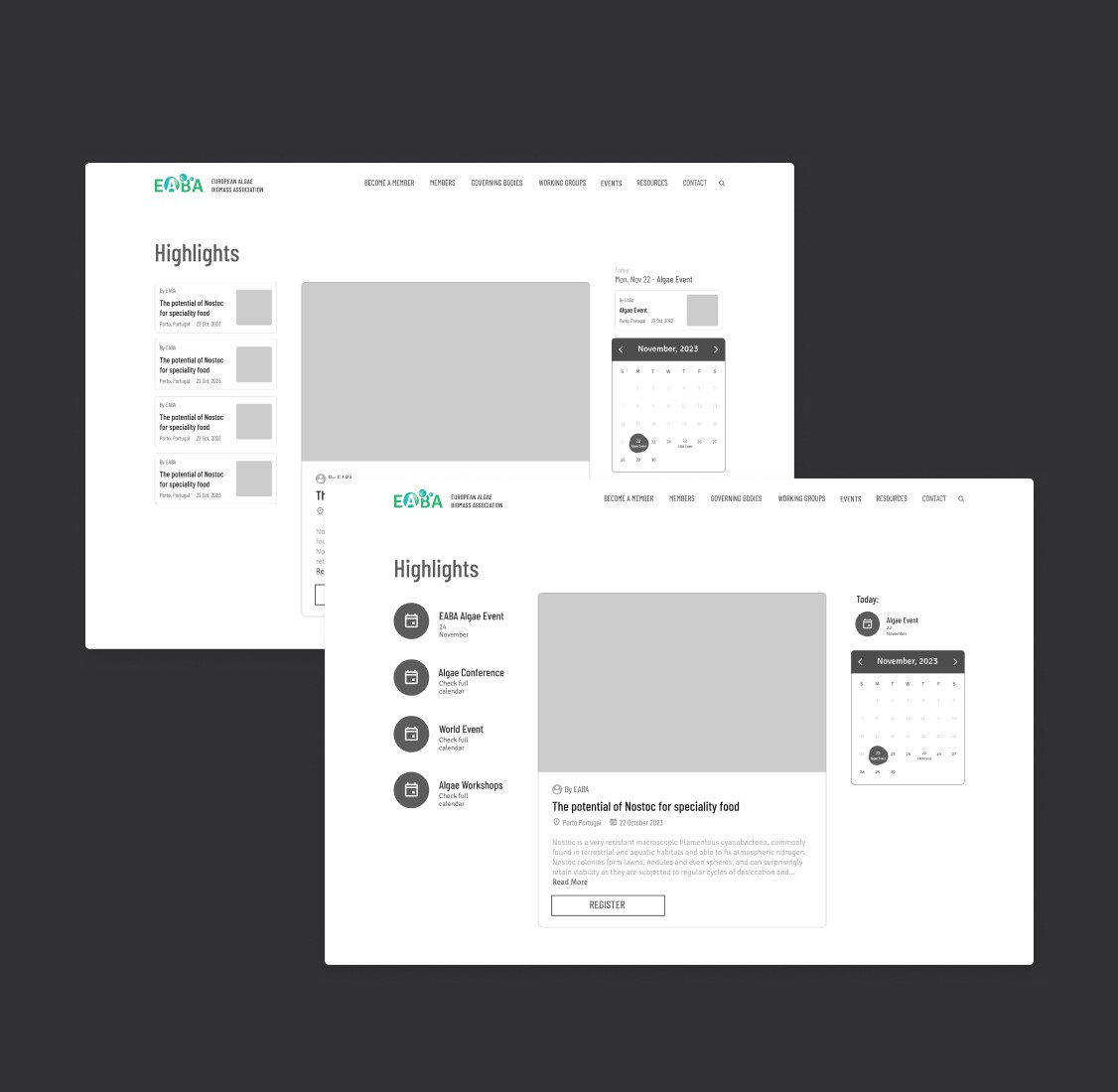
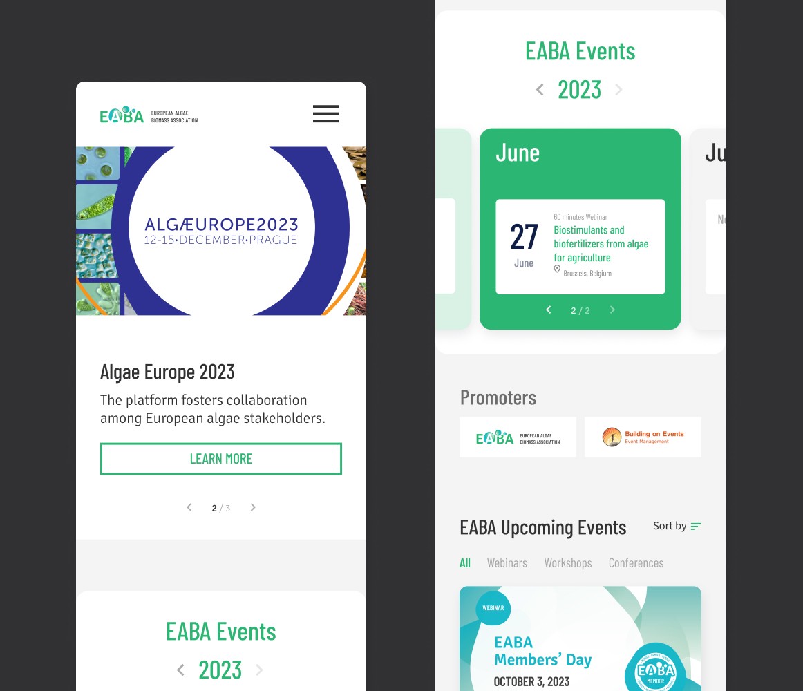
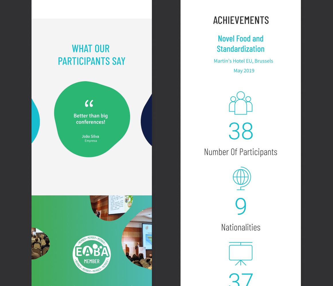
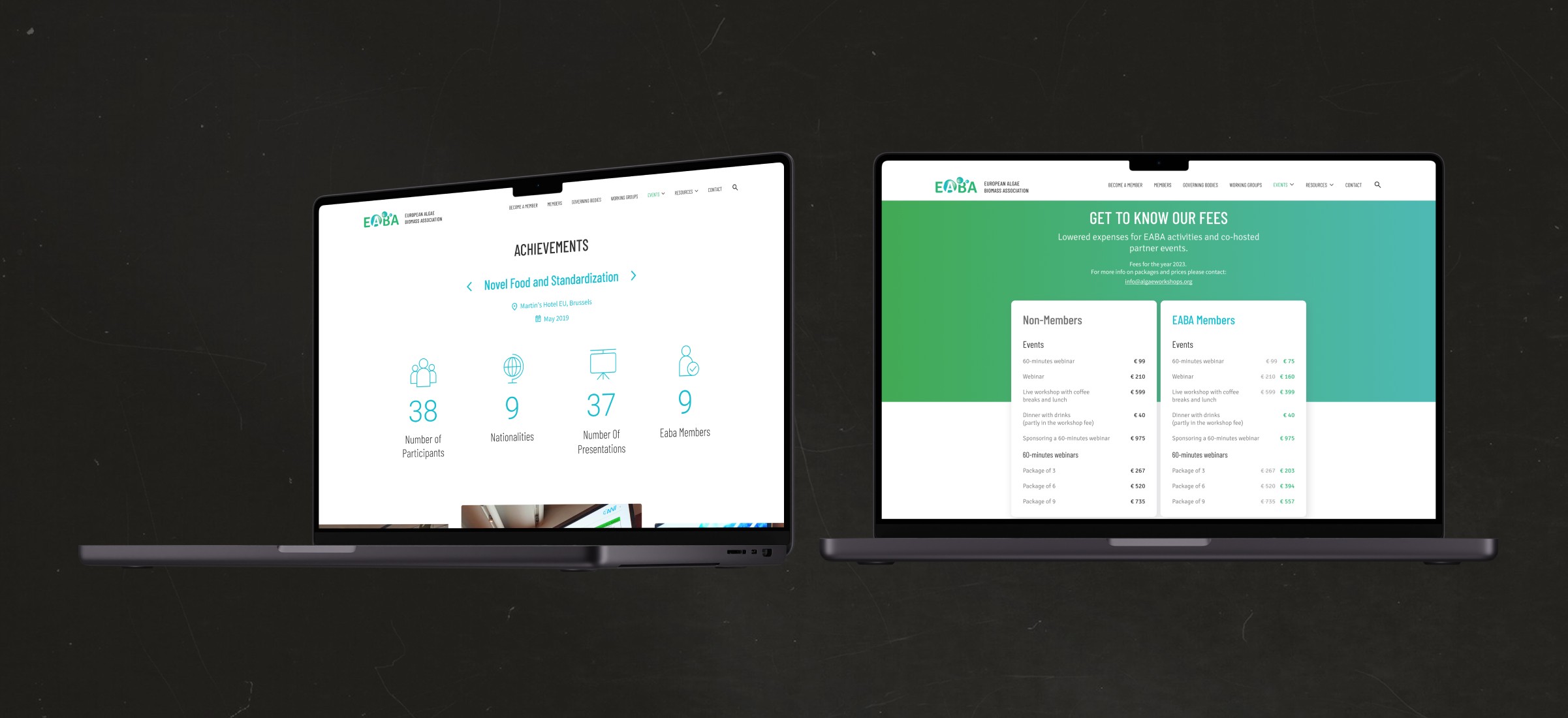
Events Page
The Events page presented a significant challenge in terms of design and functionality, necessitating an intuitive interface for users to seamlessly navigate both upcoming and past events, while facilitating easy registration.
Additionally, statistics from past events, along with videos and comments, were incorporated to enhance user engagement.

New Events Page

Old Events Page
New Events Page
Old Events Page
New Events Page
Old Events Page
New Events Page
Old Events Page
Other Pages
The remaining pages, as mentioned earlier, were not as critical as the ones mentioned above. They underwent minor changes primarily focused on UI design rather than functionality and structure, as seen previously.

Final UI Design
In the final UI, I implemented the typography and colors outlined in the brand guidelines, consistent with the logo crafted by Tasting Design, onto the approved lo-fi wireframe, ensuring responsiveness throughout.
Below, I outline the primary adjustments and offer a comparison slide to elucidate the modifications made to each page.
Homepage
To enhance the homepage’s initial impact, I opted for a modern design while preserving EABA’s identity. Additionally, the rest of the page became visually more engaging, with improved UI cards for event registration, ensuring a more appealing user experience.
New Homepage
Old Homepage
New Homepage
Old Homepage
New Homepage
Old Homepage
New Homepage
Old Homepage
"Become a Member" Page
This page required a more compelling layout to encourage user membership. By drawing inspiration from similar websites with membership pages, I implemented industry best practices to enhance its effectiveness.
New "Become a Member" Page
Old "Become a Member" Page
New "Become a Member" Page
Old "Become a Member" Page
New "Become a Member" Page
Old "Become a Member" Page
New "Become a Member" Page
Old "Become a Member" Page
Events Page
The Events page presented a significant challenge in terms of design and functionality, necessitating an intuitive interface for users to seamlessly navigate both upcoming and past events, while facilitating easy registration.
Additionally, statistics from past events, along with videos and comments, were incorporated to enhance user engagement.
New Events Page
Old Events Page
New Events Page
Old Events Page
New Events Page
Old Events Page
New Events Page
Old Events Page
Other Pages
The remaining pages, as mentioned earlier, were not as critical as the ones mentioned above. They underwent minor changes primarily focused on UI design rather than functionality and structure, as seen previously.
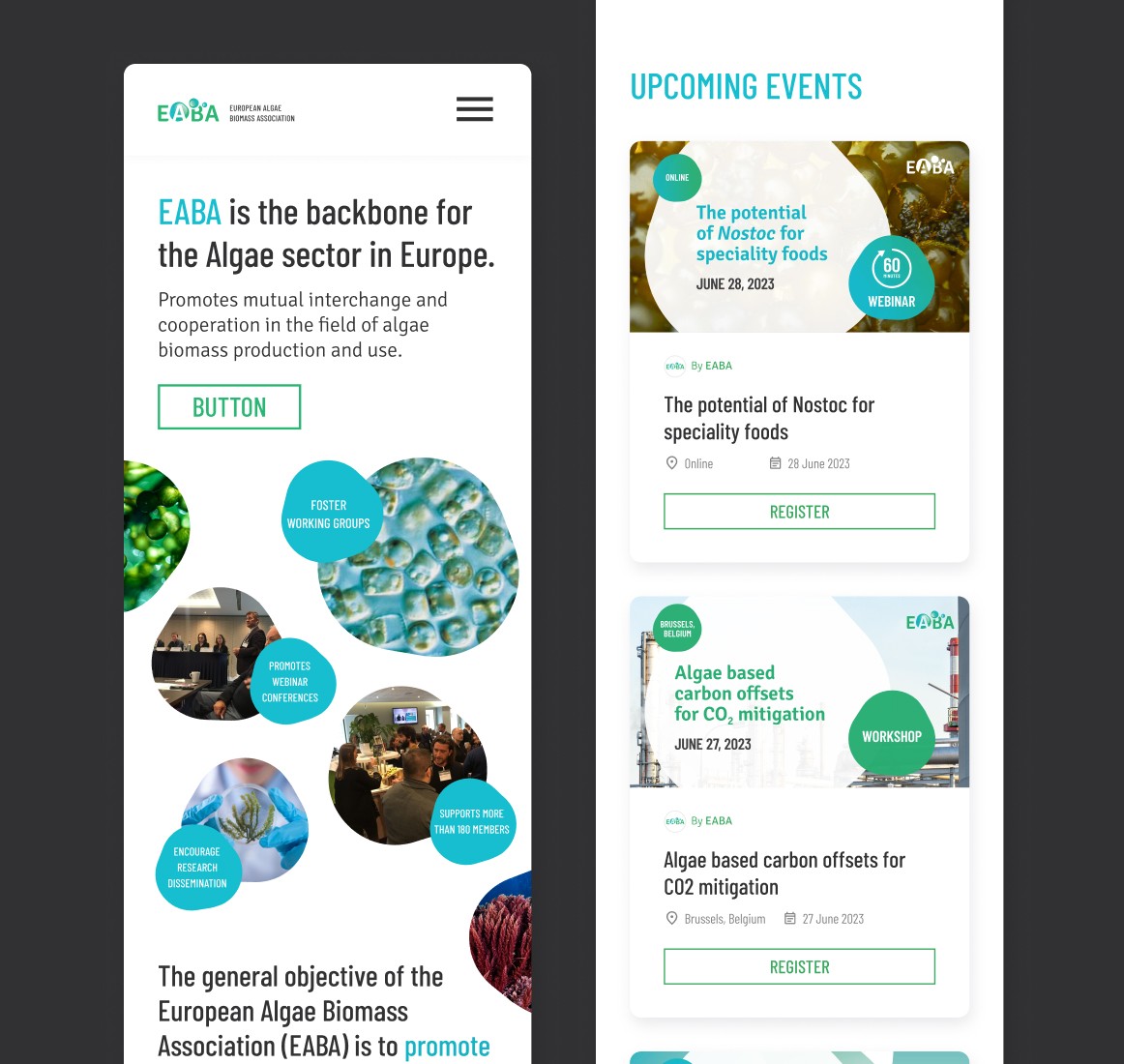
Mockups
Mockups of some of the pages and sections of the pages, both mobile and desktop.


Mockups
Mockups of some of the pages and sections of the pages, both mobile and desktop.
Implementation
In collaboration with the Bydas development team, I meticulously verified each implementation using Chrome DevTools to ensure that the website was accurately translated from its design in Figma. This iterative process involved multiple revisions until the website closely matched the original design.
This iterative process involved multiple revisions until the website closely matched the original design.

